


Fishbone Diagram and AI: The Complete DMAIC Guide for 2026


This article expands on a short post we shared on LinkedIn about using AI with the Fishbone Diagram. Readers there are already swapping their own reflections. Add yours to that thread, then read the full breakdown below.
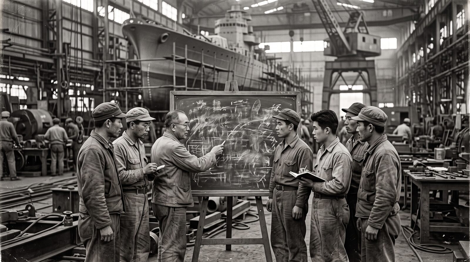
For more than eighty years, the Fishbone Diagram has done one quiet, radical thing: it refuses to let teams blame a person when the real fault sits in the system. Kaoru Ishikawa drew the first one in a shipyard in 1943 to stop finger-pointing and force engineers to look at the whole process. That instinct, find the system not the blame, is exactly why the tool still matters in an age of generative AI.
Here is the tension worth sitting with. AI can populate a Fishbone Diagram with fifty plausible causes in seconds. That speed feels like progress. But a polished list of causes is not a list of proven causes, and confusing the two is how good teams waste real money. This guide walks through the history, the mechanics, where the tool sits in DMAIC, the mistakes that quietly ruin analyses, and the disciplined way to let AI accelerate the work without letting it replace the proof.
7 Insights at a Glance
If you only have ninety seconds, here are the seven things worth remembering about the Fishbone Diagram and AI.
- It was built to depersonalize problems. Ishikawa designed the diagram in 1943 to shift blame away from workers and onto the system of interacting causes.
- It is the anchor of the Analyze phase. In DMAIC, the fish head is your measurable Y and the bones are the candidate Xs you must test.
- The categories are forcing functions. The 6 Ms (manufacturing) and 4 Ps (service) stop teams from fixating on one obvious area.
- AI cures blank-page syndrome. A good prompt returns a broad, neutral 6 M breakdown that breaks groupthink and speeds ideation.
- AI output is hypotheses, not causes. Large language models predict plausible text, not physical truth, so they can hallucinate confident, wrong causes.
- Statistics close the gap. The vital few causes must be proven with data, typically a p-value below 0.05, before you act.
- The winning pattern is hybrid. Use AI to generate and rank, use Six Sigma to validate and control. Speed plus rigor, not one without the other.
Table of Contents
- What Is a Fishbone Diagram?
- Key Facts at a Glance
- Origin and History of the Ishikawa Diagram
- How the Fishbone Diagram Works
- Where the Fishbone Diagram Sits in DMAIC
- Common Mistakes That Ruin a Fishbone Diagram
- AI in the Loop: Augmenting the Analyze Phase
- Risks and Limits of AI in Root Cause Analysis
- The AI-Assisted DMAIC Workflow
- Real Case Studies
- Sample AI Prompts for Practitioners
- Frequently Asked Questions
What Is a Fishbone Diagram?
A Fishbone Diagram, also called the Cause-and-Effect or Ishikawa diagram, is a visual tool that maps the many possible causes of a single problem. The problem, or effect, sits at the head of the fish on the right. A horizontal spine runs left, and major cause categories branch off it like bones. Smaller causes branch off those, building a hierarchy that turns a messy, multi-variable problem into one readable map.
The one line to remember: the Fishbone Diagram is a hypothesis-generation tool, not a conclusion. It tells you where to look, not what is true.
The American Society for Quality recognizes it as one of the Seven Basic Tools of Quality, alongside check sheets, control charts, histograms, Pareto charts, scatter diagrams, and stratification. If you want a structured grounding in all seven, our Seven Basic Tools of Quality certification covers them in depth.
Key Facts at a Glance
| Attribute | Detail |
|---|---|
| Also known as | Cause-and-Effect diagram, Ishikawa diagram |
| Created by | Kaoru Ishikawa, Japanese engineer and quality theorist |
| Year and place | 1943, Kawasaki shipyards, Japan |
| First published | Ishikawa’s Guide to Quality Control (1952) |
| Formally named | By Joseph M. Juran in the 1962 Quality Control Handbook |
| Classification | One of the Seven Basic Tools of Quality (ASQ) |
| DMAIC phase | Primarily the Analyze phase |
| Common frameworks | 6 Ms (manufacturing), 4 Ps (service), 5 Ms + E |
The data points below recur throughout this guide and are drawn from the cited case studies and research.
| Metric or Fact | Detail |
|---|---|
| Origin | First used in 1943 at the Kawasaki shipyards to address process variation. |
| Defect reduction (manufacturing) | A mid-sized manufacturer cut assembly-line defects by 40% using a digital Fishbone Diagram to trace integration failures. |
| Sigma-level improvement | An MSME label-printing firm raised its flexographic printing sigma level from 3.6 to 4.5 using DMAIC and Fishbone analysis. |
| Healthcare delay resolved | At the Huntsman Cancer Institute, Fishbone analysis isolated the causes of a chronic 20-minute check-in-to-page delay. |
| AI accuracy vs. validation | AI prediction accuracy for defect likelihood is cited at 90%+, yet still needs statistical validation (p < 0.05) to confirm a true root cause. |
Origin and History of the Ishikawa Diagram
Kaoru Ishikawa was a chemical engineer, statistician, and one of the founding figures of post-war Japanese quality management. In 1943, working as a process-improvement consultant at the Kawasaki shipyards, he saw the same problem in meeting after meeting: workers and engineers could not systematically discuss the tangle of causes behind a defect. Sessions slid into blame, or fixated on the most recent error instead of the underlying failure.
His fix was visual. By arranging causes into branches that resemble a fish skeleton, he forced teams to categorize their thinking and cover every operational domain. The structure depersonalized the analysis, moving the conversation from “who” to “what in the system.” Ishikawa refined the technique across industries and published it in his 1952 book, Guide to Quality Control.
The tool went global thanks partly to Dr. Joseph M. Juran, the American quality pioneer who, alongside W. Edwards Deming, helped shape Japan’s quality surge. In the 1962 edition of his Quality Control Handbook, Juran named the framework the “Ishikawa diagram” in honor of its creator. Ishikawa later summed up his philosophy in a single line that still defines the tool’s spirit: quality control begins with education and ends with education. The diagram was always meant to teach systems thinking, not just to log causes.
How the Fishbone Diagram Works
The mechanics are simple and deliberate. The specific defect, the effect, is stated at the head of the fish. A spine runs left, and major categorical bones branch off at angles. Those categories are cognitive forcing functions: they stop a team from tunneling on one visible area and push it to consider the full spectrum of causes. To avoid blank-page paralysis, practitioners use mnemonic category sets matched to their work.
The 6 Ms (Manufacturing and Production)
| Category | What it covers | Example probes |
|---|---|---|
| Manpower (People) | The human element beyond simple operator error | Training efficacy, fatigue, shift dynamics, cognitive load |
| Machine (Equipment) | Tools and infrastructure | Calibration, maintenance, tooling wear, equipment age |
| Material | Physical raw inputs | Vendor specs, batch variability, degradation, storage |
| Method (Process) | How the work is supposed to be done | SOP clarity, routing, deviation from standard |
| Measurement | The systems used to assess the process | Gauge precision, inspection criteria, GR&R |
| Mother Nature (Environment) | External operational conditions | Temperature, humidity, particulates, static discharge |

Choosing the Right Framework
Forcing a 6 M structure onto a service problem produces sparse, unhelpful diagrams. Different environments call for different category sets.
| Framework | Best for | Categories |
|---|---|---|
| 6 Ms | Manufacturing, hardware, production | Manpower, Machine, Material, Method, Measurement, Mother Nature |
| 4 Ps | Service, healthcare admin, IT, transactional | People, Process, Policy, Place/Technology |
| 5 Ms + E | Product development, transactional product | Manpower, Machine, Material, Method, Measurement + Environment |
Whatever the variant, the rule holds: secondary and tertiary causes branch off the main bones, unpacking the problem into a layered map ready for analytical probing.
Where the Fishbone Diagram Sits in DMAIC
DMAIC, Define, Measure, Analyze, Improve, Control, is the empirical backbone of Six Sigma. The Fishbone Diagram is the central anchor of the Analyze phase, the moment a project pivots from measuring the problem to finding what drives it.
At the heart of Six Sigma sits the paradigm Y = f(X). The Y is your critical-to-quality output, the painful defect under investigation. The Xs are the inputs and conditions that influence it. The Measure phase establishes a solid baseline for Y. The Analyze phase hunts the Xs. The Fishbone Diagram executes that translation directly: the fish head is Y, and the dozens of bones are the hypothesized Xs.

The diagram rarely works alone. It is the routing node for a broader toolkit: the 5 Whys drills depth into each bone, Pareto analysis isolates the vital few from the fifty-plus candidates a full diagram can produce, hypothesis testing proves which Xs matter, and a FMEA turns validated causes into preventative controls.
| Tool fed by the Fishbone | What it adds |
|---|---|
| 5 Whys | Depth: drills each bone past the surface symptom to the systemic cause. |
| Pareto analysis | Prioritization: separates the vital few causes from the trivial many. |
| Hypothesis testing | Proof: confirms statistically whether an X drives the Y (p < 0.05). |
| FMEA | Prevention: converts validated causes into ranked risks and controls. |
Common Mistakes That Ruin a Fishbone Diagram
The tool is simple, which is precisely why it is so often misused. Four pitfalls recur.
Stopping at “human error.” Naming the operator who slipped is an observation of a symptom, not a root cause. The Six Sigma question is why the system allowed or forced that error. Was the procedure ambiguous? Was the person overloaded? Was the interface badly designed? Stopping at human error leads to weak fixes like “retrain the employee” that rarely prevent recurrence.
Listing symptoms instead of causes. Writing “low hydraulic pressure” under Machine just restates the problem. The real cause might be a deteriorated O-ring seal. A diagram full of symptoms describes the problem in detail without diagnosing it.
Skipping data validation. Building a huge diagram and then implementing fixes based on a show of hands violates the core tenet of Six Sigma. The diagram generates hypotheses; only data confirms causes. Skip the proof and you fund “solutions” that never move the metric.
Vague problem statements and overcrowding. As the Juran Institute notes, a weak problem statement dooms the diagram. “Quality is bad” yields a useless map. Anchor the head with something specific and time-bound, such as “the defect rate on the Q4 line rose from 1.2% to 3.8% in October.” And resist cramming in hundreds of causes, which only creates analysis paralysis.
AI in the Loop: Augmenting the Analyze Phase
Generative AI, from ChatGPT to Claude to Gemini, has changed how teams open the Analyze phase. Instead of staring at a blank whiteboard, practitioners now use AI as a cognitive partner to accelerate and deepen the work. We cover this end to end in our guide on ChatGPT, Gemini, and Claude in DMAIC.
It breaks groupthink. In a traditional workshop, the loudest or most senior voice anchors the room. Feeding the defect to an AI and asking for a structured 6 M breakdown gives the team a broad, neutral baseline of hypotheses, so energy goes to evaluating rather than generating.
It surfaces non-obvious links. AI is strong at pattern recognition. Where a human fixates on machine calibration, an AI prompted across all 6 Ms might flag an interaction between ambient humidity and the curing time of a newly sourced adhesive, a correlation the team never considered.
It is moving into the software. Tools like Minitab Engage now embed AI to map factors onto digital fishbones and format them for regression or design of experiments, bridging brainstorming and quantitative modeling.
Risks and Limits of AI in Root Cause Analysis
Treating a probabilistic model as an infallible problem-solver is where the danger lives.
Hallucinated or generic causes. Large language models predict the next plausible token; they have no physics-based understanding of your shop floor. Without rigorous prompting they drift to textbook answers like “lack of training” or invent confident, fabricated causal links.
False confidence. The eloquence and clean structure of AI output can lull a busy team into skipping validation and jumping to the Improve phase. AI suggestions are untested hypotheses. Only human expertise, data collection, and tests like ANOVA or a 2-sample t-test bridge the gap to a true root cause.
Data privacy. Feeding proprietary tolerances, defect rates, or customer logs into public LLMs creates real intellectual-property and compliance risk. Use enterprise-grade or governed AI instances for AI-assisted root cause analysis.
| Common Myth | Grounded Reality |
|---|---|
| AI identifies the definitive root cause. | AI generates probable hypotheses; statistical validation by humans confirms the true cause. |
| AI eliminates the need for team brainstorming. | AI prevents blank-page syndrome, but human context is needed to filter and rank its output. |
| Fishbone diagrams only suit manufacturing. | Variants like the 4 Ps make the tool effective in software, healthcare, and services. |
| More AI-generated causes mean a better analysis. | Overcrowding causes paralysis; use Pareto to isolate the vital few before collecting data. |
The AI-Assisted DMAIC Workflow
To capture AI’s speed without inheriting its risks, interleave generation with rigor. This five-step sequence is the documented best practice.
| Step | Action | Owner |
|---|---|---|
| 1. Define the measurable Y | Write a quantified, time-bound problem statement before touching AI. | Human team |
| 2. Generate Xs with AI | Prompt the AI as a Black Belt; force the 6 Ms or 4 Ps and MECE sub-causes. | AI + facilitator |
| 3. Filter, cluster, rank | Discard hallucinations; use affinity diagrams and Pareto to find the vital few. | Human team |
| 4. Validate with data | Run t-tests, chi-square, or correlation to prove influence (p < 0.05). | Human team |
| 5. Act and control | Implement fixes, update SOPs, deploy SPC charts; AI can simulate options. | Human-led |
The contrast in Step 1 matters most. “Our software deployments keep failing” is unusable. “In Q3, post-release rollbacks rose from 2.1% to 6.4%, mostly from database schema integration errors” gives AI and the team something testable.
Real Case Studies

| Organization | Problem | Result |
|---|---|---|
| Canadian Solar | Variation in silicon nitride film thickness on solar cells | A 2-sample t-test (p < 0.05) proved butterfly-valve cleaning frequency drove the variance; yield improved. |
| Huntsman Cancer Institute | Chronic 20-minute check-in-to-page delay | Fishbone mapping of real workflow replaced “hire more staff” with targeted process fixes. |
| MSME label printer | Misregistration and ink/cutting defects (84% of rejects) | Printing sigma level rose from 3.6 to 4.5; slitting reached 4.8. |
| Mid-sized manufacturer | Product defects traced to software integration failures | Digital fishbone found poor maintenance data as the cause; defects fell 40%. |
The thread across all four: the diagram pointed to the right place, and statistics, not opinion, confirmed the cause. The Canadian Solar case and the Huntsman healthcare case are both publicly documented.
Sample AI Prompts for Practitioners
Casual queries produce generic output. Strong prompts establish a persona, lock the framework, and force structured, hierarchical answers. Here are two you can adapt today.
Baseline 6 Ms generation: “Act as a Lean Six Sigma Master Black Belt with 20 years of manufacturing experience. We are in the Analyze phase of a DMAIC project. Our problem statement is [insert quantified statement]. Generate an Ishikawa analysis using the 6 Ms. For each category, give four specific, technically plausible root-cause hypotheses. Avoid generic answers like ‘lack of training’ or ‘machine broke’.”
Cognitive-bias auditor: “Review these hypotheses our team generated for [problem]: [list]. Act as a critical Six Sigma auditor. Identify our cognitive biases, especially over-reliance on human error. Point out any 6 M or 4 P categories we ignored. Suggest three non-obvious interacting variables we likely overlooked.”
To go deeper on prompting AI for the full DMAIC cycle, our AI-Powered Root-Cause Analysis Specialist certification walks through engineered prompts and the validation steps that keep them honest.
The Takeaway
AI fills the Fishbone Diagram. Six Sigma proves the cause. Use AI to brainstorm possibilities and break groupthink. Use statistics to separate the real driver from the plausible guess. Together they turn fast guesses into genuine root causes.
Build the Skills That Matter in the AI Era
If this guide was useful, these AIGPE certifications take you from reading about root cause analysis to running it with confidence.
AI-Powered Certification Track for Quality 4.0
- Certified AI-Powered Root-Cause Analysis Specialist
- ChatGPT and Six Sigma: AI Visualization Beginner
Quality and Problem-Solving Specializations
- Seven Basic Tools of Quality Expert Certification
- Certified FMEA Specialist
- Certified Pareto Analysis Specialist
Six Sigma and Minitab Tracks
Frequently Asked Questions
What is a Fishbone Diagram used for?
A Fishbone Diagram is used to brainstorm and organize the possible causes of a specific problem so a team can investigate them systematically. It is most often used in the Analyze phase of Six Sigma DMAIC to map candidate causes before testing them with data.
Why is the Fishbone Diagram also called the Ishikawa diagram?
It is named after Kaoru Ishikawa, who created it in 1943. Joseph Juran formally christened it the “Ishikawa diagram” in the 1962 edition of his Quality Control Handbook in honor of its inventor.
What are the 6 Ms of a Fishbone Diagram?
The 6 Ms are Manpower (People), Machine, Material, Method, Measurement, and Mother Nature (Environment). They act as cause categories that force a team to consider every operational domain rather than one obvious area.
Can AI replace the Fishbone Diagram?
No. AI can populate a Fishbone Diagram with candidate causes quickly, but those are hypotheses, not proven causes. Human domain expertise and statistical validation are still required to confirm the true root cause.
What is the difference between the 6 Ms and the 4 Ps?
The 6 Ms suit manufacturing and hardware processes. The 4 Ps (People, Process, Policy, Place/Technology) suit service, healthcare, and IT environments where there is no physical raw material or machinery to analyze.
How does the Fishbone Diagram fit into DMAIC?
It anchors the Analyze phase. The fish head is the measurable problem (the Y), and the bones are the candidate causes (the Xs). It then feeds the 5 Whys, Pareto analysis, hypothesis testing, and FMEA.
About the Author
Rahul Iyer is a Master Black Belt and the founder of AIGPE, the Advanced Innovation Group Pro Excellence. AIGPE has trained over 1,000,000 professionals across 193 countries. All AIGPE programs are accredited by the CPD Standards Office (Provider 50735), the Project Management Institute (PMI Provider 5573), and the Society for Human Resource Management (SHRM Provider RP9220). His work sits at the intersection of Operational Excellence and Enterprise AI, helping professionals apply rigorous quality methodology while deploying AI with governance, clarity, and measurable ROI. Connect with Rahul on LinkedIn for Lean, Six Sigma, Project Management, and AI insights.
Citations and References
- ASQ: Seven Basic Quality Tools
- Juran Institute: The Ultimate Guide to Cause and Effect Diagrams
- Minitab: Canadian Solar Case Study
- University of Utah Health: Fishbone Diagram (Huntsman case)
- INFORMS: Combining Generative AI with the DMAIC Framework
- Air Academy Associates: Generative AI for Root Cause Analysis
- ResearchGate: Six Sigma DMAIC Label Printing Case Study
- PMC: Cause-and-Effect Diagram for Quality Improvement