


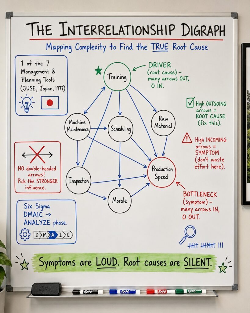
Interrelationship Digraph: 7 Powerful Insights to Find the True Root Cause


An Interrelationship Digraph turns a tangle of causes into a clear map of what is driving your problem, and what is merely a symptom.
This article expands on a short post I shared on LinkedIn about the Interrelationship Digraph. Readers there are already swapping their own reflections. Add yours to that thread, then read the full breakdown below.
Most teams attack the loudest problem in the room. The line is slow, so they push for speed. Defects spike, so they add inspectors. Months pass, budgets shrink, and the problem sits exactly where it was. The reason is simple: they were fighting a symptom, not a cause.
The Interrelationship Digraph exists to end that cycle. It is a visual mapping tool that untangles complex, multi-directional cause-and-effect relationships and, through a bit of arrow-counting arithmetic, points you straight at the root cause worth fixing. This guide walks through where it came from, how to build one, how to read it, and the mistakes that quietly ruin the analysis.
7 Insights at a Glance
If you only have ninety seconds, here are the seven things worth remembering about the Interrelationship Digraph.
- It maps influence, not time. A flowchart shows the order events happen in. A digraph shows how factors drive one another, which is a completely different question.
- It is one of the 7 Management and Planning Tools. Developed in Japan by a JUSE committee under Yoshinobu Nayatani and announced in 1977, it was built to handle messy, qualitative problems that numbers alone cannot.
- Arrows out equal a root cause. A node with many outgoing arrows and few incoming ones is a driver. Fix it, and downstream problems ease on their own.
- Arrows in equal a symptom. A node flooded with incoming arrows is a bottleneck. It is loud and expensive, but attacking it directly is wasted effort.
- Never draw a double-headed arrow. If two factors influence each other, the team must decide which direction is stronger. Two-way arrows cancel out the math.
- It kills the loudest-voice problem. Because the team debates each pair of factors, the analysis surfaces consensus instead of rank or personality.
- It fits the Analyze phase of DMAIC. Use it to decide which few variables deserve heavy statistical testing before you spend a dollar on solutions.
Table of Contents
- What Is an Interrelationship Digraph?
- Key Facts at a Glance
- Where the Tool Came From
- How It Differs From Other Root-Cause Tools
- How to Build One, Step by Step
- Reading the Arrows: Drivers, Bottlenecks, and Hubs
- A Worked Example From the Factory Floor
- Benefits and the Pitfalls That Ruin It
- Myths vs Facts
- Frequently Asked Questions
What Is an Interrelationship Digraph?
An Interrelationship Digraph (also called an interrelationship diagram, relations diagram, or network diagram) is a tool that maps the cause-and-effect links among the many factors contributing to a complex problem. Instead of forcing a single straight line from cause to effect, it lets you draw the reality: factors that feed into one another, loop back, and reinforce each other.
The word “digraph” is short for “directed graph.” Each factor becomes a node, and every relationship becomes a single arrow pointing from cause to effect. Once every pair has been compared, you simply count the arrows on each node. That count converts a subjective team debate into an objective ranking of causes.
The one line to remember: symptoms are loud, root causes are silent, and the digraph is how you tell them apart.
Key Facts at a Glance
| Attribute | Detail |
|---|---|
| Also known as | Interrelationship diagram, relations diagram, network diagram, ID |
| Tool family | One of the 7 Management and Planning Tools (New 7 QC Tools) |
| Origin | JUSE committee led by Yoshinobu Nayatani, Japan; announced 1977 |
| Popularized in the West | Michael Brassard, The Memory Jogger Plus+ (1989) |
| Primary purpose | Map multi-directional cause and effect to find root drivers |
| Best team size | 5 to 7 cross-functional subject-matter experts |
| Practical factor count | 10 to 20 nodes (theoretical max around 50) |
| Where it fits | Six Sigma DMAIC Analyze phase; PMBOK Manage Quality; ASQ CMQ/OE |
Where the Tool Came From
Through the 1960s, quality work leaned on Kaoru Ishikawa’s Seven Basic Tools, the histogram, Pareto chart, fishbone, and their siblings. Those tools are brilliant with numbers, but they struggle with words: opinions, judgments, and the tangled administrative problems that show up in planning rather than on the shop floor.
To close that gap, the Union of Japanese Scientists and Engineers (JUSE) formed a committee in 1972 under Yoshinobu Nayatani. After five years of work, the group published the Seven New Management and Planning Tools in 1977. The Interrelationship Digraph was one of them, sitting alongside the affinity diagram, tree diagram, matrix diagram, matrix data analysis, process decision program chart, and activity network diagram. The tools reached Western managers largely through Michael Brassard’s 1989 book The Memory Jogger Plus+, which turned the Japanese concepts into step-by-step facilitation guides.


The digraph is a team sport. Drafting one alone just maps a single person’s blind spots.
How It Differs From Other Root-Cause Tools
The most common confusion is treating the Interrelationship Digraph as a fancy fishbone. They solve different problems. A fishbone assumes many independent causes feed into one effect. A digraph assumes the causes also act on each other. The table below sorts out when to reach for each tool.
| Feature | Interrelationship Digraph | Affinity Diagram | Fishbone (Ishikawa) | Tree Diagram |
|---|---|---|---|---|
| Primary purpose | Map multi-directional cause and effect | Group messy ideas into themes | Find causes of one defined effect | Break a goal into sub-tasks |
| Structure | Network of nodes and arrows | Clustered sticky notes | Fish-skeleton spine | Hierarchy, parent to child |
| Direction of logic | Multi-directional, can loop | None, just grouping | One way, causes to effect | Top-down |
| Typical output | Ranked drivers and bottlenecks | Themed categories | Categorized list of causes | Sequenced action plan |
In practice the tools chain together. Teams often brainstorm with an affinity or brainstorming exercise, sort possible causes with a fishbone diagram, and then use the digraph to see how those causes influence one another.
How to Build One, Step by Step
A reliable Interrelationship Digraph follows a disciplined sequence. Rushing it produces confident nonsense.
- Frame the issue and gather the team. Write a single, clear problem statement, ideally phrased as a question, and pull together five to seven experts from different functions.
- List the contributing factors. Bring these over from a completed affinity or fishbone diagram. Aim for 10 to 20 factors; more than that and the comparisons explode.
- Place the nodes randomly. Spread the cards in a wide circle. Do not cluster related cards, because proximity tricks the team into seeing only local links and missing the cross-departmental ones.
- Compare every pair. For each pair of nodes, ask which one influences the other more, and draw one arrow from cause to effect. Never draw a double-headed arrow; force the team to pick the stronger direction.
- Iterate and validate. Timebox sessions to about an hour to avoid fatigue, then revisit, challenge assumptions, and finalize.
![]()
The golden rule: one arrow, one direction. If A and B affect each other, the team debates which pull is stronger.
Reading the Arrows: Drivers, Bottlenecks, and Hubs
Once the arrows are drawn, tally the outgoing and incoming count for every node. Three patterns matter.
| Pattern | Arrow signature | What it means | What to do |
|---|---|---|---|
| Key driver (root cause) | Many out, zero or few in | The engine of the problem. Nothing upstream is causing it. | Fix this first; downstream issues ease automatically. |
| Key outcome (bottleneck) | Many in, zero or few out | The loudest symptom, a dumping ground for other failures. | Do not attack directly; trace its arrows back. |
| Critical hub | High total (in plus out) | A heavily connected transfer point. | Monitor closely; any change ripples widely. |

Count the arrows and the hierarchy appears: green drives the system, red absorbs its failures.
A Worked Example From the Factory Floor
Picture a mid-sized plant hit by a sudden spike in final-assembly defects. A cross-functional team lists eight factors from a fishbone session: Operator Training, Machine Maintenance, Raw Material Quality, Production Speed, Product Design, Inspection Procedures, Employee Morale, and Supplier Quality. After an hour of pairwise debate, they tally the arrows.
| Factor | Arrows out | Arrows in | Designation |
|---|---|---|---|
| Operator Training | 4 | 0 | Primary root driver |
| Product Design | 2 | 0 | Secondary driver |
| Supplier Quality | 1 | 0 | Secondary driver |
| Raw Material Quality | 2 | 2 | Critical hub |
| Machine Maintenance | 2 | 1 | Intermediate |
| Employee Morale | 1 | 1 | Intermediate |
| Inspection Procedures | 0 | 4 | Symptom |
| Production Speed | 0 | 5 | Primary bottleneck |
Left to instinct, leadership would have squeezed Production Speed or overhauled inspection, the two most visible pain points. The digraph proves those are outcomes, with five and four incoming arrows and nothing going out. The real lever is Operator Training: four arrows out, none in, entirely within management’s control. Invest there and machine abuse falls, morale rises, speed recovers, and inspection eases. One upstream fix, several downstream problems solved. That is the brand belief in action: don’t blame the people, fix the system.

The same math scales from a factory line to a hospital ward or a software backlog.
Benefits and the Pitfalls That Ruin It
The tool’s strengths are real, but each has a matching failure mode a facilitator must guard against.
| Strength or risk | What happens | How to handle it |
|---|---|---|
| Systems thinking | Forces a team to see the whole ecosystem, not silos | Always use a cross-functional group |
| Objective consensus | Math replaces rank and volume | Have the senior person speak last to avoid anchoring |
| Time-intensive | A 20-node diagram needs 190 comparisons | Keep nodes under 20; timebox to 60 minutes |
| Visual clutter | Arrows become a spaghetti chart | Digitize the final draft; color-code lines |
| Thought-pattern bias | Clustered cards hide cross-links | Place cards randomly in a wide circle |
| Drafting in isolation | The map reflects one person’s bias | Require sign-off from at least four people |
Myths vs Facts
| The myth | The fact |
|---|---|
| It is just a messy flowchart. | A flowchart maps time; a digraph maps influence, independent of sequence. |
| Draw a double-headed arrow when two factors affect each other. | That cancels the math. Pick the stronger direction. |
| You need lots of data first. | It was built for qualitative input; it tells you where to collect data next. |
| The node with the most incoming arrows is the root cause. | That node is the symptom. The root cause has the most outgoing arrows. |
Build the Skills That Matter in the AI Era
The Interrelationship Digraph is one tool in a much larger problem-solving toolkit. If you want to master root-cause analysis and the wider quality discipline, these AIGPE certifications are the natural next step.
Quality and Problem-Solving
- Seven Basic Tools of Quality Expert Certification
- 8D Problem Solving Specialist
- Certified FMEA Specialist
Six Sigma Certification Track
AI-Powered Track for Quality 4.0
Frequently Asked Questions
What is an Interrelationship Digraph used for?
It is used to map how the many factors behind a complex problem influence one another, so a team can identify the true root-cause drivers and stop wasting effort on symptoms.
Is an Interrelationship Digraph the same as a fishbone diagram?
No. A fishbone assumes several independent causes feed into one effect. A digraph maps causes that also act on each other, including feedback loops the fishbone cannot show.
Why are double-headed arrows not allowed?
Because the analysis works by counting incoming versus outgoing arrows. A two-way arrow adds one to both counts and cancels the signal, so the team must decide which influence is stronger.
How do you find the root cause on the diagram?
Count the arrows on each node. The node with the most outgoing arrows and the fewest incoming ones is the primary driver, the root cause worth fixing first.
Where does it fit in Six Sigma?
It is an Analyze-phase tool in DMAIC. It helps teams narrow a long list of possible causes down to the few variables that deserve deeper statistical testing.
How many factors should an Interrelationship Digraph have?
Ten to twenty works best in practice. The theoretical limit is around fifty, but the number of pairwise comparisons grows quickly and exhausts the team.
About the Author
Rahul Iyer is a Master Black Belt and the founder of AIGPE, the Advanced Innovation Group Pro Excellence. AIGPE has trained over 1,000,000 professionals across 193 countries. All AIGPE programs are accredited by the CPD Standards Office (Provider 50735), the Project Management Institute (PMI Provider 5573), and the Society for Human Resource Management (SHRM Provider RP9220). His work sits at the intersection of Operational Excellence and Enterprise AI, helping professionals apply rigorous quality methodology while deploying AI with governance, clarity, and measurable ROI. Connect with Rahul on LinkedIn for Lean, Six Sigma, Project Management, and AI insights.