
Imagine your car suddenly won’t start on a Monday morning. You could blame the battery and call it a day. But what if the real problem lies deeper? Maybe the battery died because the car hadn’t been driven in weeks. Or it sat idle that long because no one realized the battery needed regular charging. That’s the heart of root cause analysis and where we try the 5 Whys vs Fishbone; digging past the obvious and uncovering what’s really going on.
In quality management and process improvement, two tools often lead this detective work: the 5 Whys and the Fishbone Diagram (also known as the Ishikawa Diagram or Cause-and-Effect Diagram). Both help teams get to the root of a problem, but they work in different ways.
So, when should you use which? Let’s dive into both tools and see how they work and most importantly, how to choose the right one for your specific situation.
What Is Root Cause Analysis?
Before comparing the tools, let’s quickly revisit the purpose they serve. Root cause analysis (RCA) is a structured way to find the underlying reason a problem happened, not just the surface-level symptoms. It’s about asking, “Why did this happen?” again and again until you land on the source of the issue.
Effective RCA helps:
- Prevent repeat problems
- Improve systems and processes
- Reduce downtime and rework
- Boost customer satisfaction
Now, let’s meet the two most popular RCA tools: the 5 Whys and the Fishbone Diagram.
The 5 Whys: A Simple, Straightforward Approach
At first glance, the 5 Whys might look like a child’s game; just keep asking “Why?” until someone gives up. But in structured problem-solving, it’s anything but trivial. When used thoughtfully, it becomes a powerful tool to peel back the layers of symptoms and uncover the root of the issue that actually needs fixing.
What makes the 5 Whys special is its simplicity matched with clarity. You don’t need charts, software, or specialized training to use it. All you need is the willingness to stay curious, suspend judgment, and follow the trail of logic.
Let’s take a closer look at why this method works so well.
Why It Works: Following the Causal Chain
Every effect has a cause, and every cause is the result of something else. Problems in any organization, whether in production, customer service, software, or HR are often the outcome of a series of small breakdowns, not one dramatic event.
The 5 Whys forces you to go beyond that first “obvious” cause. It pushes teams to trace a single cause-and-effect path until they reach a failure in the system, process, or standard. That’s often where the real issue hides—not in the final symptom, but several steps before it.
This isn’t about blaming a person or pinpointing a mistake. It’s about revealing systemic weaknesses that can be strengthened.
Why “Five”? Is That a Magic Number?
Not necessarily. You might find the root cause by the third “why.” Or you might need seven.
The number five is more of a guideline than a rule. The idea is to go deep enough that you stop uncovering symptoms and start identifying something that, once fixed, would prevent the issue from recurring.
For example, if you stop at “The worker didn’t follow instructions,” you might implement more training. But if you dig further and realize “The instructions were outdated and unclear,” then improving documentation becomes the true preventive measure.
Who Should Be Involved?
While it’s possible to run the 5 Whys solo, especially if the problem is within your direct workflow, it works even better as a small-group exercise. Include people who are directly involved in the process or have firsthand knowledge of the task in question.
Why? Because each answer to “why” is only as good as the team’s understanding. If you’re analyzing a late delivery, the shipping team might offer one perspective. But the purchasing team or the supplier management team might reveal another angle entirely.
Getting the right people in the room leads to more grounded, accurate answers.
How to Do It Right: A Few Ground Rules
To get the most out of the 5 Whys method, here’s how to structure the conversation:
- Clearly define the problem
Don’t jump into “why” without agreeing on what the problem is. Phrase it in simple, specific language: “Customer received incorrect invoice” is clearer than “Billing error.” - Assign a facilitator or note-taker
Someone needs to guide the discussion and document each answer logically. This keeps the process structured and focused. - Avoid jumping to conclusions
Sometimes, people answer the first “why” with a preloaded assumption. Encourage the team to validate each step with real examples or data. - Look for process, not people
The goal is not to say “John didn’t do his job.” The goal is to understand what in the system allowed the failure to happen. If a person made an error, ask why the system allowed it.
What Makes It Powerful in the Real World
The strength of the 5 Whys isn’t just in finding one answer, it’s in building a culture of curiosity and continuous improvement. Over time, teams that regularly use the 5 Whys start to think differently. They stop treating mistakes as one-offs and begin to see them as opportunities to tighten processes and clarify expectations.
In lean manufacturing, healthcare, software, and service industries alike, this mindset leads to fewer recurring issues, better accountability, and stronger systems.
A Slight Variation: The “Five Whats” Approach
Sometimes, “why” can feel accusatory, especially in cultures where blame is feared. In such cases, a softer approach using “what” questions works just as well.
Instead of: “Why did the employee miss the step?”
Ask: “What made it possible for the step to be missed?”
This keeps the focus on systems and removes defensiveness from the conversation—making root cause analysis more collaborative and constructive.
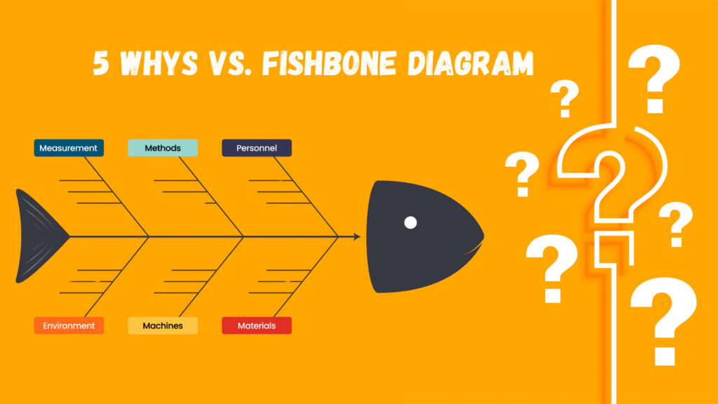
The Fishbone Diagram: A Visual, Collaborative Tool
The Fishbone Diagram, often referred to as the Ishikawa Diagram, is one of the most structured tools in the root cause analysis toolbox. What sets it apart is its ability to organize chaos into categories, visually guiding a team to think expansively without losing focus. Rather than chasing a single line of reasoning, it invites you to step back and look at the full spectrum of possibilities.
It’s like creating a mental map of everything that could go wrong—before you zero in on what actually did.
The Real Strength: Structured Group Thinking
In many workplace scenarios, problems are rarely caused by a single factor. A failed delivery might result from a late procurement order, a breakdown in communication, a misconfigured software setting, or even something as unexpected as a power outage during shift change.
With so many moving parts, unstructured brainstorming can get messy. People talk over each other, ideas get lost, and conversations spiral into blame games or side discussions.
That’s where the Fishbone Diagram shines—it channels brainstorming into a purposeful path. By segmenting causes into categories like Man, Machine, Method, and so on, the team can zoom into each slice of the process without getting overwhelmed.
The diagram becomes a canvas for disciplined exploration.
Creating a Fishbone Diagram Step by Step
Though it’s often drawn on whiteboards or digital tools, the process begins in conversation. Here’s how most teams go about building one:
- Start with a clearly defined problem
Frame it in a neutral, observable way. For example, instead of “Orders are getting messed up,” write “Incorrect SKUs shipped to customers.” - Draw the diagram’s structure
The spine is a horizontal arrow pointing to the problem. Off the spine, draw six main “bones,” one for each major category: People, Process, Equipment, Materials, Environment, and Measurement. - Brainstorm under each category
As a team, go category by category. What are the potential causes that could contribute to the issue? Encourage wild ideas, and don’t censor thoughts at this stage. - Add sub-causes
For each idea, ask what could be causing that cause. This layered thinking helps uncover hidden contributors that aren’t visible at first glance. - Review and prioritize
Once the fishbone is full, take a step back. Which causes seem most likely? Which ones repeat across categories? Which deserve deeper investigation?
Why It’s More Than Just a Diagram
At first glance, the Fishbone might look like just another tool for meetings. But it offers something deeper: a shared mental model for understanding complex systems.
When everyone on the team sees the cause categories filling up, something powerful happens. People begin to realize that the problem isn’t isolated, it’s embedded in how things connect. This system-level awareness often sparks long-term improvements that go far beyond fixing the immediate issue.
For example, if you’re seeing recurring late deliveries, your first instinct might be to look at the shipping department. But through the Fishbone, you may uncover issues with order entry, unclear policies, outdated software, and fluctuating stock, all of which silently contribute. These insights might never surface in a regular meeting.
Customizing the Categories
While the six standard categories (People, Machine, Material, Method, Measurement, and Environment) work well in most manufacturing or operations environments, they’re not set in stone.
Depending on your industry, you can tailor the branches to better reflect your context. For example:
- In software development, teams might use:
- Requirements
- Code
- Infrastructure
- Deployment
- Testing
- User behavior
- Requirements
- In healthcare, teams often use:
- Staff
- Equipment
- Policy/Procedure
- Patient
- Environment
- Communication
- Staff
The structure is flexible; the goal is to group your thinking, not limit it.
Ideal Scenarios for Using Fishbone
There are moments when a Fishbone Diagram feels almost essential. For instance:
- You’re in a cross-functional workshop and need to align on what’s really going wrong.
- You’ve faced a repeated issue, and past fixes haven’t solved it.
- You’re preparing for a quality audit and need a documented thought process.
- Your team has different theories, and you need a visual tool to sort them out.
It’s particularly useful when conversations tend to drift, or when the issue spans departments or functions. The diagram grounds the discussion in structure, ensuring that brainstorming doesn’t become guesswork.
Going Beyond the Surface: What Happens After the Diagram
Completing a Fishbone Diagram doesn’t mean the job is done. What it gives you is a diagnostic snapshot, a visual of everything that might be wrong. The real value comes when the team dives into specific causes, investigates them with data or direct observation, and takes action to address the root contributors.
Think of the Fishbone as your map. It tells you what areas need further exploration—but you still need to walk the terrain.
Comparing the Two: Which One Should You Use?
Let’s look at the differences side by side:
| Criteria | 5 Whys | Fishbone Diagram |
| Approach | Linear | Visual and multi-dimensional |
| Depth | Focuses on one cause chain | Explores many possible causes simultaneously |
| Complexity | Best for simple or known issues | Ideal for complex, unclear issues |
| Collaboration Level | Can be done solo or in small group | Requires team input and group discussion |
| Speed | Quick | Takes more time to build and analyze |
| Visual Appeal | Minimal (text-based) | High (diagram-based) |
| Best For | “We just need to find out why this happened.” | “We’re not sure what’s causing this problem.” |
So, it’s not about one being better than the other—it’s about context. Sometimes, you even use both tools together.
Using Both Together: A Hybrid Approach
In real-life projects, professionals often combine both tools. Here’s how that works:
- Start with a Fishbone Diagram to map out all the possible categories and causes. It gives a 360-degree view.
- Pick one cause from the diagram, then apply the 5 Whys to it.
- Repeat the 5 Whys for multiple branches, especially the ones that seem high-risk or high-impact.
This hybrid approach helps you stay open to multiple root causes, while also going deep into each one to validate whether it’s the true source.
For example, a team at a manufacturing plant faced repeated equipment breakdowns. They used a Fishbone to explore all categories—under “Machine,” they found “Overheating” as a sub-cause. Then they applied the 5 Whys to that specific issue and discovered that a sensor wasn’t functioning due to lack of calibration.
An Use Case: Quality Issue in Packaging
Let’s walk through a realistic use case to illustrate the difference:
Problem: A food company is seeing an increase in damaged products during shipping.
Option 1: Using 5 Whys
- Why are the products damaged?
→ Because the packaging burst open in transit. - Why did it burst open?
→ Because the boxes were stacked incorrectly. - Why were they stacked incorrectly?
→ Because the loading team didn’t follow the stacking instructions. - Why didn’t they follow instructions?
→ Because they weren’t trained properly. - Why weren’t they trained?
→ Because training for new procedures wasn’t scheduled.
Root Cause: Training gap due to poor onboarding process.
Option 2: Using a Fishbone Diagram
The team gathers in a room and sketches a Fishbone:
- Man: Inexperienced staff, unclear roles
- Method: No written standard operating procedure (SOP) for stacking
- Machine: Pallet jack malfunctioning
- Material: Weaker packaging material used this quarter
- Measurement: No audit data on packaging failures
- Environment: Warehouse floor slippery near loading area
Now, they dig into each branch. Turns out, two causes combined: the packaging material was changed to a cheaper version, and the staff was unfamiliar with the new stacking pattern it required.
Root Cause: Change in packaging material without process updates and training.
In this case, the Fishbone revealed a dual-cause situation that 5 Whys alone might have missed.
Final Thoughts: Choose What Helps You Think Clearly
Choosing between the 5 Whys and the Fishbone Diagram isn’t about being loyal to one method. It’s about understanding the nature of your problem and choosing the tool that brings clarity.
- Use the 5 Whys when you’re chasing one clear symptom and want a fast, focused answer.
- Use the Fishbone Diagram when the issue is tangled, multi-layered, or you need input from multiple departments.
And when you’re not sure? Start visual. Go Fishbone. Then drill deep with 5 Whys.
Root cause analysis isn’t about tools. It’s about thinking critically, asking good questions, and improving systems so the same mistakes don’t happen twice.
Looking to master these tools? Whether you’re a quality manager, project lead, or problem-solver in any role, practicing both techniques will build your problem-solving muscle. They don’t just fix issues—they prevent them. And that’s where real improvement begins.